
Monday, November 12, 2012
Sunday, November 11, 2012
The Good & the Bad... Logos
Here are some of the logos I find good and bad. Some I say are good because I like the design, other because they're memorable. The ones I find bad are because the design I find unattractive, plain, or doesn't express anything about the product. All of the examples are well known and of course this is just my personal opinion.
Note: Apple also made it on my worst logo list as an 11th logo. I have a love/hate relationship with the Apple.
The Good

The Bad

Monday, November 5, 2012
Midterm Self Portrait
 | ||
| Self Portrait |
Sunday, October 21, 2012

Updated Trapped!
Here's an updated version of my text drawing Trapped. Hopefully the closeness of the letters help convey the feeling a little better now.


Beginning of Midterm Self-Portrait
Here's an early look at my self-portrait project. It's time consuming but in the end I think it's gonna be pretty cool.
 | ||
| My hair floats! (That will be fixed later) |
Saturday, October 13, 2012
Text! 6 Word Me.
So here's the last one. Six word autobiography - or rather description - creative, honest, persistence, dreamer, nerd, strong.
 |
| 6 Word Me! |
Text! Non-Representational
Here's my non-representational text drawing. I'm not sure if I like it. I wish I could use color and/or opacity settings! Whether or not I lament on that point this is really challenging! Working solely with text to create an image is tough and I really have to think/see a different way.
Made using symbols - #, $, &, and *
 |
| Symbols - Non-representational |
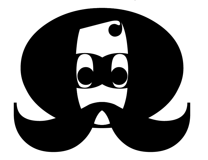
Text Drawing - Mr. Q
Okay, so I was going to do a more "realistic" drawing for my representational piece but as I was working the non-representational one Mr. Q appeared. And I love him. A lot. He may be the most adorable lettered man ever.
 |
| Mr. Q - Representational Text Drawing |
He is solely built out of four Roman letters - Q, O, i, and j.
Text! Text drawing...
So in Digital Imaging we're now exploring text and ways it can be used graphically to convey meaning. The next few posts will be experiments to create four different text images or drawings - expressive, representational, non-representational, and a six word autobiography.
Here's the first one:
In this text drawing I used two fonts. One for the 'p' in the diamond and one for the others. After selecting my fonts I created outlines and played with anchors, position, scale to achieve a "trapped" feeling.
Here's the first one:
 | |
| Trapped - Expressive |
Standards of Beauty & Photoshop Ethics

When it comes to Photoshop ethics I agree that the use of the program has been grossly abused. Models are shaved, airbrushed, and simply distorted. The image that remains sometimes becomes humanly impossible to attain. Many are placing pressure on magazines to label retouched photographs and blame the industry for an increase in body image disorders especially among teen girls. Even the American Medical Association has weighed in on the issue.
However more than the use of Photoshop I believe larger questions in society need addressed: Why are these images so valued? Why is the public convinced they must intimate these images? If the public rejects impossibly perfected standards of beauty why do they sell? What factors and what value is placed on body image, especially for girls and women? Are these issues really new and stemming from over Photoshopped spreads or is this really just .02 version of an older debate and social flaw?
Personally I don't like how Photoshopped ads and magazines are but I don't agree with restricting the use of Photoshop or even labeling it. I believe in education - visual education, as a way to answer Photoshop criticisms and open discussions on the use of imagery to sell and manipulate consumer values. This is a digital age and digitized images are part of our technological landscape.
The public is aware of their disadvantages compared to models, celebrities and retouched photos. The average person doesn't have a stylist, makeup artist, or a famous photographer to prepare for their Facebook photo and they know that. The constant barrage of fantasy cover-girls (and boy-men), media obsession with obesity, printed lectures for self improvement, and do-it-yourself makeup/style tutorials is frustrating. People don't have time. So why not blame Photoshop. It's all bullshi*t anyway. They're lying to us. They're not socially conscious or responsible.
Blaming Photoshop for those things is like blaming Apple for releasing the iPhone (insert number here) for your credit card debt. Isn't this just another ill from over-consumption? Just something to think about.

Links to more articles on this topic:
Cardinal Bird Part II
This image is the tryout before doing our self portraits using the pen tool to trace from a photograph. From the last bird post I've added in a background playing with repetition, pattern, overlapping shapes, and opacity.


Laser Cutter Pattern Part II
So my last attempt at a laser cutter pattern failed. The red lines cannot be touching. This is my updated pattern post.


My Face. Squashed. An Illustration
For my digital imaging class we've begun working with Adobe's
Illustrator. For an interesting take on self portraits we smashed our
faces against a scanner and worked on making simple illustrations from
it. Below is my lovely squashed face and amateur Illustrator skills on
display.


Wednesday, October 3, 2012
My Face. Squashed and Scanned.

Yeah so that happened. What do other people do in their 8am morning classes? ^__^
The Pen Tool and Birds

So we learned how to use the pen tool in Illustrator and how to use it to trace. Then we got this awesomely proud picture of a Cardinal to recreate using the technique.

Laser Cutter Pattern

Monday, October 1, 2012
Composite - Altering Meanings

For this assignment we altered content of an original image and added text to change the meaning. This is originally a women's magazine ad from the Victorian era, now with some fashionable anime girls.
Illustrator Symbols

Sunday, September 23, 2012

Sunday, September 16, 2012


On Larry Lessig TED Talk
 |
| Lessig Rocking a Creative Commons Tee |
My generation is probably the first to use the internet to 'write' back using computer technologies and the internet. Growing up I remember DOS, floppy discs, the change to CDs, and the dawn of the internet. I'm only twenty-six but my father jumped on computers in the early nineties and is a computer technician to this day.
Uses for the internet have grown at an incredible rate. So much so, I even have a hard time keeping up. What happened to building your own webpage? How do I use RSS feeds? Why do I need to have a hundred accounts and what is the purpose of Twitter (Seems inanely pointless to me)?
Still creating content, remixing content, copyright wars - I completely understand what Lessig is talking about. Napster was a huge debate when I was in high school. As a teen I hated Metallica for instigating the shutdown of peer-to-peer sharing (though I couldn't deny the awesomeness of Enter the Sandman). The point was clear: the internet openned new thresholds for thieving.
But what about these grey areas, such as the examples in Lessig's speech? This isn't for consumerism. This isn't harmful to the original creators. But shouldn't credit be given? What about privacy? Maybe public figures don't want to become paper talking heads. Or maybe Warner Brothers doesn't want Harry Potter characters to be shipped or slashed in videos. It's complicated debate.
Personally, I enjoy remix culture, but I understand why some are fighting for stricter control.
Source Video:
Larry Lessig: How Creativity is being Strangled by the Law
Walk Ride Bike
 |
| Mondrian Subway |
 | |
| George: The Economist |
Yes, George shamed me as a college student. But despite that I learned a thing or two and got to know one of Philadelphia's very interesting citizens.
Wednesday, August 29, 2012
Rules of Randomness
99u.com's article The Rules of Randomness and How You Can Stand Apart is a nice piece that reminds readers to embrace diversity in their lives and to keep trying - over and over. Frans Johansson talks about the "click moment" where everything just suddenly works out or seemingly becomes an overnight success. Johansson explains that life is unpredictable and that hard work and planning alone doesn't equal success. A random chance does.
So how to increase random awesome clicky-ness? Diversity. Being open to different people, paths, books, and hard work.Taking many different chances instead of laboriously betting on the same chance as everyone else. The last important step to awesome randomness -- repeated failure and persistence. After all, Johansson tells us that the makers of Angry Birds had over 50 games that no one cared about until they 'randomly' hit it big with a game about barnyard civil war.

So how to increase random awesome clicky-ness? Diversity. Being open to different people, paths, books, and hard work.Taking many different chances instead of laboriously betting on the same chance as everyone else. The last important step to awesome randomness -- repeated failure and persistence. After all, Johansson tells us that the makers of Angry Birds had over 50 games that no one cared about until they 'randomly' hit it big with a game about barnyard civil war.
Subscribe to:
Comments (Atom)